Preview of Facebook Comments in RSS Bandit and the Ribbon
Mo 25 Mai, 2009; by dareo - Project Status
I’ve made some more progress in integrating the Facebook news feed into the next version of RSS Bandit currently codenamed Colossus. This weekend I completed the addition of support for viewing and replying to comments in the news feed. So here are some screenshots of current comment workflow for interacting with Facebook comments
Fig 1: Viewing the comments in response to a funny status update from Anil Dash

Fig 2: Responding to the comment by pressing "Ctrl + R" or right-clicking and selecting Post Reply.
Fig 3: The news feed on Facebook with the comment posted from RSS Bandit
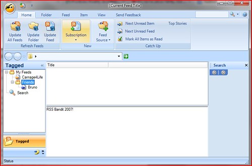
The second major change coming in the Colossus release is the adoption of the design elements from the Microsoft Office fluent user interface such as the ribbon, contextual tabs, galleries and live preview. To prepare for this change, we’re first building a prototype of the redesigned user interface and once we’re happy with it we will start refactoring the RSS Bandit application to enable swapping out our existing menus and taskbars with the new interface.
Here’s where we are in the design prototype for next release. Let me know what you think in the comments.

- #1 Robin Capper on Mo 25 Mai, 2009 at 9:27
-
Hi, Hard to tell from just a screenshot but I'd have made "Update Feeds/Folder" and "Mark as Read" as prominent as Subscription
- #2 Tangent on Mo 25 Mai, 2009 at 2:25
-
Facebook feature is awesome.
I am a user who subscribes to dozens' of blogs, and the number keeps growing. Ribbon is nice when it comes to organize a vast amount of features, but it has a major drawback of taking large amount of vertical real-estate, icons are hidden in different tabs so it takes additional clicks to get to.
So for RSSBandit which I love to be a simple app, Ribbon would be more counter productive than its appearance. As for my current usage of RSSBandit, I only keep one toolbar, which only has 6 essential buttons I use the most.
- #3 Kal on Mo 25 Mai, 2009 at 8:21
-
Vertical real estate is way more important than pretty.
- #4 GN on Di 26 Mai, 2009 at 4:05
-
As someone who subscribes to several hundred feeds, I would love to see an optimized ribbon with contextual commands in each view - the mockup looks awesome! I would make the first three primary activities buttons by themselves and the rest can be narrower...which three are primary is debatable - I use "Update All", "Mark All as Read" and clip/save type stuff most often.
- #5 Robin Capper on Mi 27 Mai, 2009 at 7:14
-
A little off topic but the UX feature I'd like to see in Bandit is a plain (so can copy paste elsewhere w/o formatting) reader temaplate that also had all the Flagged Item (not just follow up)
- #6 Justausr on Mi 27 Mai, 2009 at 11:57
-
The Facebook stuff looks terrific. Thanks for the continued efforts.
The new Ribbon stuff is promising, although I personally am not a ribbon fan. What would really help RSS Bandit is to have a few small changes:
a) don't put all messages in the list. This takes a lot of time and memory. Only unread message should be added when one selects a feed or category. An option to show all could be provided.
B) being able to filter the displa for a time window, without creating a seach would be useful. Having a box to show last N hours/days/weeks/months would be great. This is a viewing option and wold be retained until changed, evne when switching categories/feeds. Searches use their default time view.
C) I see "tagged". Are you added tagging? If so GREAT!!! If you do, add the ability to export the tagged items to xml and csv. Also, please make sure that atgged items are not cleaned up.
D) add an option to strip all html formatting from feeds as you create the xml to be displayed for the category/feed. Bad formatting for a feed can screw up the xsl and display. Be nice to have this a per feed/category option with a global default. Fine grained control would be terrific, so stripping embeds, sounds, images. scripts or all would be good.
Thanks again for all the work.
- #7 Adrian on Mi 27 Mai, 2009 at 6:11
-
The Ribbon UI looks great, but based on other comments, I'm guessing it'd be nice to implement a 'lightweight' version of the UI (a-la Visual Studio's Full Screen mode?) might optimize vertical real estate.
I'd also LOVE to see quick filtering in the My Feeds treeview, as well as a way to only show feeds with unread items - while mantaining the tree structure (like Yahoo Messenger's 'show only online friends' option?)
By the way, I gotta say that this is the first RSS reader that I really do enjoy using so cheers for a great app!


